摘要:ChatGPT Images 2.0 发布仅两天,业内评价便迅速走向两极分化。一方吐槽其画面缺乏艺术感,另一方则将其奉为真正的生产力神器。本文从底层逻辑与实测出发,揭秘 Images 2.0 与 Nano Banana 的核心分歧——当 AI 生图从「像素渲染」进化到「思考推理」,我们究竟该如何重塑使用习惯?内含 3 个高阶实战 Prompt,助你快速驾驭这款新一代视觉利器。
ChatGPT Images 2.0 发布这两天,圈子里的声音挺割裂的。
有人说它画风变糙了,跑同样的唯美提示词,出来的图总觉得差点意思,甚至在某些艺术风格上还被老对手 Nano Banana 按着摩擦。但另一波天天拿 AI 干活的人(包括我)却直呼真香:文字终于不糊了,排版逻辑能自己捋顺了,做张复杂的架构图再也不用像个保姆一样手把手教它。
这种两极分化其实一点都不奇怪。OpenAI 掌门人山姆·奥特曼在发布会上放了句狠话,说这是“从 GPT-3 直接跳到 GPT-5”的飞跃。而大洋彼岸的 Nano Banana 拥趸们依旧坚守着他们的审美高地。说白了,这两拨人争论的焦点,恰恰揭示了 AI 绘图赛道正在发生的一次底层 paradigm shift(范式转移)。
一、评价劈叉的背后:底层逻辑彻底变了
翻遍外网的深度评测和技术文档,你会发现 Images 2.0 和 Nano Banana 压根就不在同一条赛道上。评价之所以两极分化,根源就在以下三个基因突变:
1. 从「模糊出图」到「逐像素推演」
以往的 AI 绘图工具(包括 Nano Banana 的底层逻辑),大都依赖扩散模型。这就好比一个高度近视的画师,先对着一块毛玻璃看噪点,再一点点把画面擦清晰。这种路子画风景、搞氛围是一绝,但一碰到文字排版,就容易变成鬼画符。
而 Images 2.0 传闻放弃了纯扩散路线,转向了自回归模型——虽然 OpenAI 对底层架构一直守口如瓶,但实际表现看,它更像是一个严谨的打字员,像大语言模型预测下一个词一样去预测下一个像素。这个底层逻辑的切换,直接让它的文本渲染精准度飙升,实测准确率高得离谱。
2. 塞进了一颗「会思考的大脑」
这是 Images 2.0 最具颠覆性的升级。当你在 ChatGPT 里开启 Thinking 或 Pro 模式,它不再是接到指令就无脑开画,而是会先停下来“动脑筋”:联网检索最新信息、规划图像排版结构、推理元素布局,最后才下笔。生成前后甚至还会自我复核纠错。
习惯了过去那种“秒出图”爽感的用户,刚上手肯定会觉得它变慢了。但这换取的是极强的逻辑性和信息密度,你不需要自己查好资料再喂给它,它能独立跑通“调研+设计”的全流程。
3. 「理性工程师」与「感性艺术家」的分流
Nano Banana 依然在“电影级真实感”、“艺术风格化”上保持着统治力,加上其强大的上下文理解,在保持角色一致性和局部重绘上体验极佳。而 Images 2.0 则更像一个刻板但严谨的工程师,它追求的是信息的精准传达、文本的绝对正确,而非单纯的视觉讨好。
如果你拿它来画二次元老婆,大概率会觉得“手感不对”。但这不是模型拉胯了,而是它的主战场变了。在大模型竞技场的盲测中,GPT-Image-2 在文生图、单图编辑、多图编辑三个榜单全部登顶,文生图更是以断层式的 241 分优势碾压了带网络搜索功能的 Nano Banana 2。
二、如何榨干 Images 2.0 的生产力?(附高阶 Prompt)
既然发力点变了,咱们用它的姿势也得跟着变。以下三个核心场景,是 Images 2.0 真正能降维打击的地方。
场景一:极限文本与 UI 界面复刻
这是 Images 2.0 当之无愧的杀手锏。别把它当画师,把它当成一个懂代码、会排版的前端工程师。
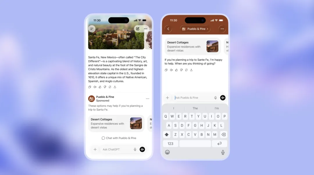
以前让 AI 画个软件界面,出来的全是抽象派乱码。现在,它能直接生成分毫不差的 VS Code 双屏工作界面,甚至连 ComfyUI 那种连线绕晕人的节点工作流,它都能给你理得明明白白,图标和小字清晰可读。对于非拉丁语系的支持更是史诗级加强,中文、日语、韩语的密集排版终于不再乱码,能直接当原生设计稿用。
👉 实战 Prompt 1:生成复杂的代码编辑器 UI
Generate a highly detailed, realistic screenshot of a modern code editor (like VS Code) running on a dark theme. The left sidebar should show a file explorer with a React project structure (components, hooks, utils). The main editor window should display complex TypeScript code for a data visualization component. The terminal at the bottom should show a successful build message. Ensure all text, syntax highlighting, and UI icons are perfectly rendered and legible.
场景二:逻辑严密的信息图表
得益于“思考模式”,它可以在生成前先梳理信息逻辑。无论是生成一张 10×10 的物品网格图,还是生成复杂的技术栈对比图,它都能自己完成资料搜集和版式规划,一次提示甚至能吐出最多 8 张风格角色连贯的系列图。
不过这里必须插播一条防坑警告:虽然排版极佳,但模型仍会产生幻觉。比如在生成车型配置表时,它可能会把 8 座写成 7 座,或者凭空捏造不存在的天窗配置。因此,用于正式商用前,人工事实核查必不可少。
👉 实战 Prompt 2:生成逻辑清晰的对比信息图
Create a professional, modern infographic comparing ‘Diffusion Models’ and ‘Autoregressive Models’ in AI image generation. Use a clean, corporate color palette (blues and grays). The layout should be split into two columns. For Diffusion Models, include icons representing ‘noise to clarity’ and list pros/cons. For Autoregressive Models, include icons representing ‘pixel-by-pixel prediction’ and list pros/cons. Ensure all text is 100% accurate, perfectly spelled, and highly readable. Include a bold title at the top.
场景三:逼真写实的照片级生成
如果你觉得 Images 2.0 默认出图不够好看,很可能是提示词里少了一个关键的“开关”。
在测试中发现,只要在提示词里加入 “photorealism” 或强调照片级真实,它生成的街拍、健身房自拍或纪实类照片,质感会发生质的飞跃。配合其对光影、微小瑕疵的精准捕捉,出片效果足以以假乱真。
👉 实战 Prompt 3:生成极具真实感的纪实照片
Extreme photorealism, shot on 35mm lens, cinematic lighting. A candid, documentary-style photo of a young creative professional working late in a dimly lit, cozy coffee shop. They are looking intently at a glowing laptop screen. On the table, there is a half-empty cup of latte with intricate latte art, and a notebook with handwritten notes. The background is slightly blurred (bokeh effect) showing rain on the window pane and neon city lights reflecting.
三、工具选择指南:别用锤子拧螺丝
面对功能越来越细分 AI 工具,与其争个高下,不如按需分配。根据日常使用场景,我整理了这份实用对照表:
| 需求场景 | 推荐工具 | 核心优势 |
|---|---|---|
| 复杂文本/UI/架构图复刻 | ChatGPT Images 2.0 | 自回归逻辑+思考模式,文字渲染近满分,支持 2K 分辨率输出 |
| 信息图表/逻辑推导 | ChatGPT Images 2.0 | 联网检索+自主规划,排版审美直线上升,摆脱“AI抽卡” |
| 纯视觉审美/艺术插画 | Nano Banana | 电影级氛围感,风格化表现依然是目前的天花板 |
| 角色一致性/个人上下文 | Nano Banana | 极强的图生图编辑能力,换装换背景不换脸,细节拿捏死死的 |
写在最后
回到最初的争议,说 Images 2.0 不够美的人没说错,它的默认基因确实更偏“理科生”;但夸它好用的人也是真心实意,因为它的逻辑推演和文本生成能力,确确实实切中了生产力的痛点。
OpenAI 在官方博客里写道:“图像是一种语言,而不是装饰。” 这大概是对 Images 2.0 最好的注解。当 AI 生图从简单的“渲染工具”进化为具备策略性的“视觉系统”,我们的使用思维也必须从“抽卡抽奖”切换到“产品经理提需求”。
想让它好用,第一轮就把任务交代清楚;要写实就加 “photorealism”,要图表就让它先 Thinking,关键数据别忘了人工兜底。刚开始可能会多费点心,但一旦跑通了这套逻辑,你会发现——AI 真正取代的,从来不是会画画的人,而是那些只会用古法重复劳作的人。
© 版权声明
文章版权归作者所有,未经允许请勿转载。
相关文章


暂无评论...